What goes into trusting an answer(er)?
How much does community engagement and certifications contribute towards eliciting trust?
Background
Atlassian University was revamping their entire catalog of courses, and with it came new certifications. Naturally, the Atlassian Community is an extension of where someone might display these accomplishments, or the business would hope that they would. Community has 2 million active users per month coming to the site, this would be a boon for gaining traction in a very contextual market for certifications.
How might we understand our current user base more regarding their perceptions of certifications?
- Role
- Project lead
- Contribution
- UX design process
- Visual design
- Researcher
- Length of time
- Two weeks
Research question
When someone goes to the community to find an answer, what kinds of information are they needing to have so that they can feel confident and trust that the person who provided the answer knows what they are talking about (in other words, do they have credibility?).
What's known about the space?
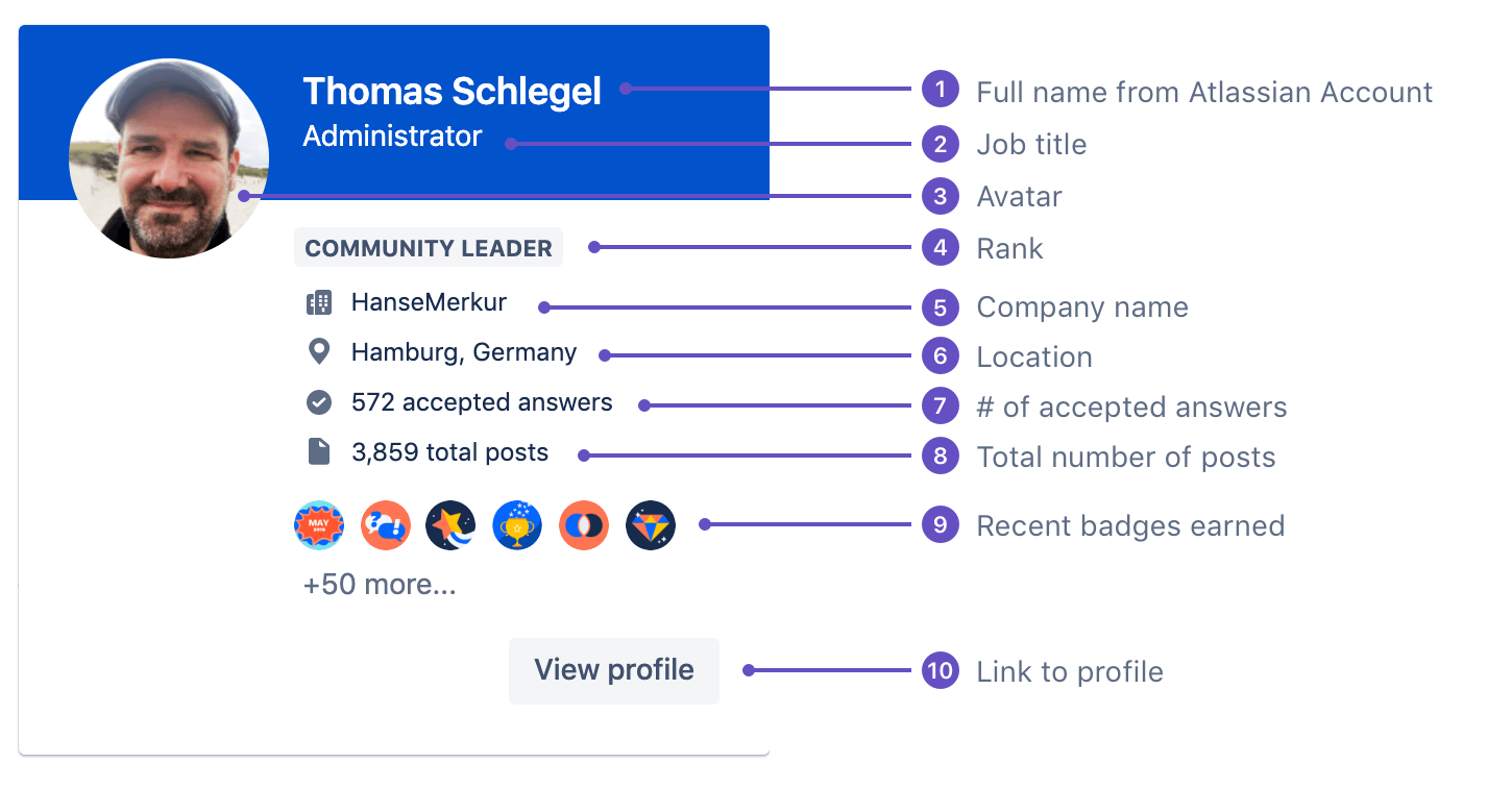
Currently visitors are using a combination of signals to determine credibility:
| Location | Signal | Description |
| On the question page | ||
| Number of upvotes | How many people also have upvoted this answer | |
| Response types | Number of comments to answers and how many times they have been 'liked' | |
| Mini profile card (appears when hovering on author's avatar) | ||
| Number of posts of author | How many posts? a little or a lot? | |
| Author's name | Is it a human name or an obscure name? | |
| Author's avatar | Do they have one? Is it a real face? Just initials? | |
| Badges earned | Which badges were earned specifically? | |
| Location | Where are they located in the world? | |
| Company name | What size of company do they work for? | |
| Job title | Is it even in the realm of someone who I'd trust? Same industry? | |
| Accepted answers | Others who have deemed that this person's answers are 'correct' as vetted by the community | |
| Successful answer ratio | The total number of accepted answers divided by the total number posts in the community. |
We also know from our data instrumentation that the hover event for the profile card occurs, on average, 126,000 times per month, denoting that it is getting a lot of attention and usage. This is roughly 29% of all accounted interactions on the site.
* It makes total sense that the number of accepted answers in the community would elicit the most amount of trust. This has been echoed by many customers in various interviews.
Methodology
Using usertesting.com with specific criteria to target people who have experience on online forums for testing.
Test A (person to person comparison)
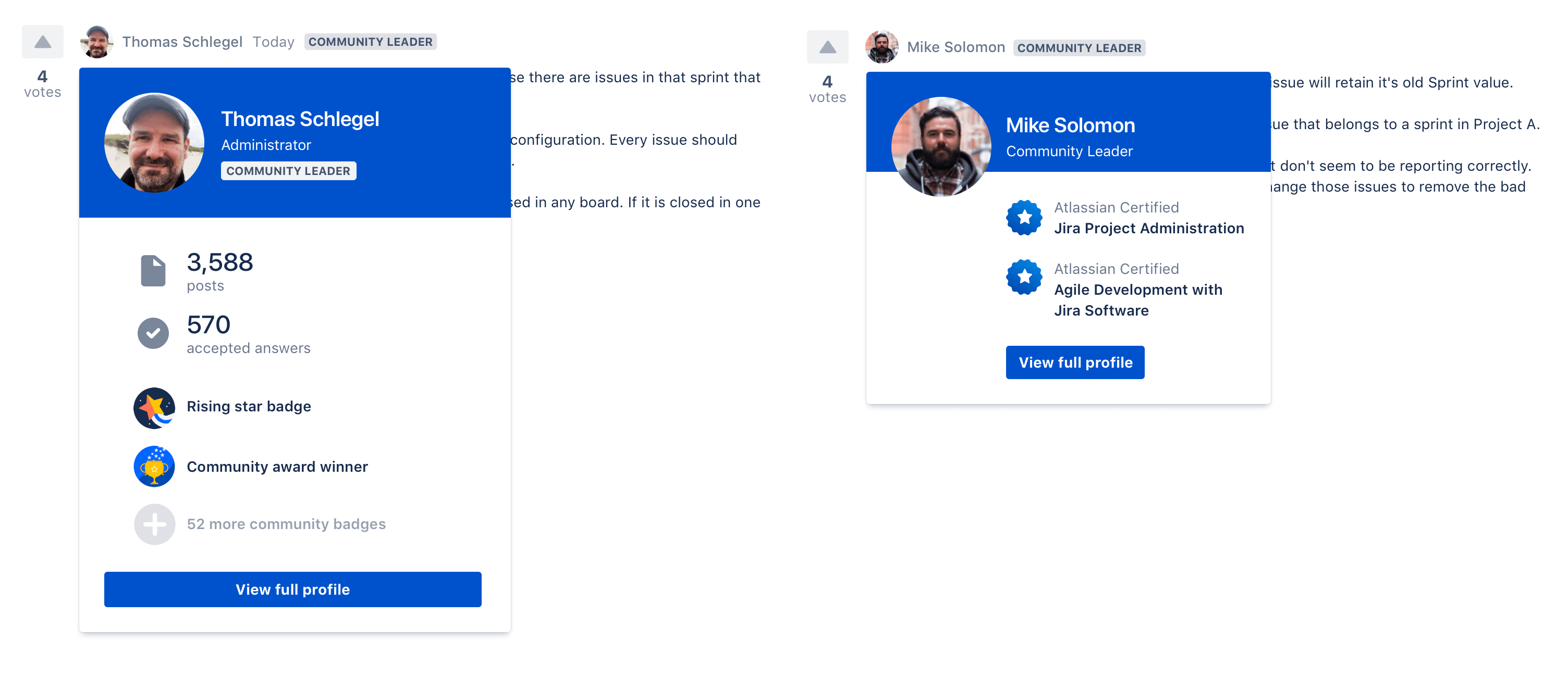
While on the same page, in an oversimplified question and answer view of the community (no interaction UI), there are two answers. Each avatar and name for each answer has a hover state. Thomas has more community engagement metrics in his profile card, while Mike has more of the Atlassian Certification information on display in his.
The central question asked in this experience: If all other factors are the same (both Community Leaders, same number of upvotes, both provided good quality answers) Which of these people are you more willing to believe?
Test B (apples to apples comparison)
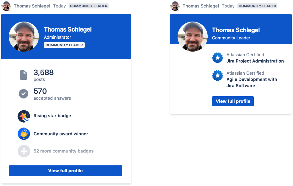
This test includes presenting two distinctly different profile cards, one that is more community engagement metrics and the other that’s more certification focused. This is meant to solicit feedback on which profile card creates more trust with the answer provided. The profile cards will appear on hover over a reduced and simplified experience of the community (only shows the question and an answer, none of the interaction UI will be present).
The results
Test A (person to person comparison)
Both certifications earned and community engagement activity help shape the credibility of a person, but they must be shown together to elicit the most amount of trust.
Apart, they reveal a missing counterbalancing element. Together, they prove to be a combination that can’t be beat. Participant 20B's oscillations are clear, as he mentally juggles the merits of certifications with what it means to contribute inside the context of a community
“I think that if this guy had the certifications, or if all things being equal, I’d still gravitate towards this one [Thomas, the version that had community engagement activity]. I’m not saying that certifications don’t matter or not important, but that doesn’t mean that you’ve been effective at participating within the user community and effectively explaining and answering their questions.”
Test B (apples to apples comparison)
Both certifications earned and community engagement activities help shape the credibility of a person, but they must be shown together to elicit the most amount of trust.
Apart, they reveal a missing counterbalancing element. Together, they prove to be a combination that can’t be beat.
"These certifications give me a good sense of the amount of information this guy’s background is in. Being able to see how many time he’s posted and how many of those answers gives me that social proof that he’s done this before. Someone can be certified but could be a pretty bad communicator. They’re know what they are talking about but can’t get their point across, and so that’s not going to help me in establishing his sense of trustworthiness. but if he’s posted accepted and its been accepted so many times, he is a good communicator, and his answers do work for the vast majority of users that aren’t as tech savvy as he is.”
Research conclusion
It's evident that the inclusion of certifications is a no brainer, especially if they have them. There is no downside. However, if they do have certifiations, trustworthiness only increases when there is social proof of activity on the platform, other else there's a slight lost of trust.
Implications for research
It has informed the need to redesign the profile hover card in a way that's more aligned to users of internet forums.
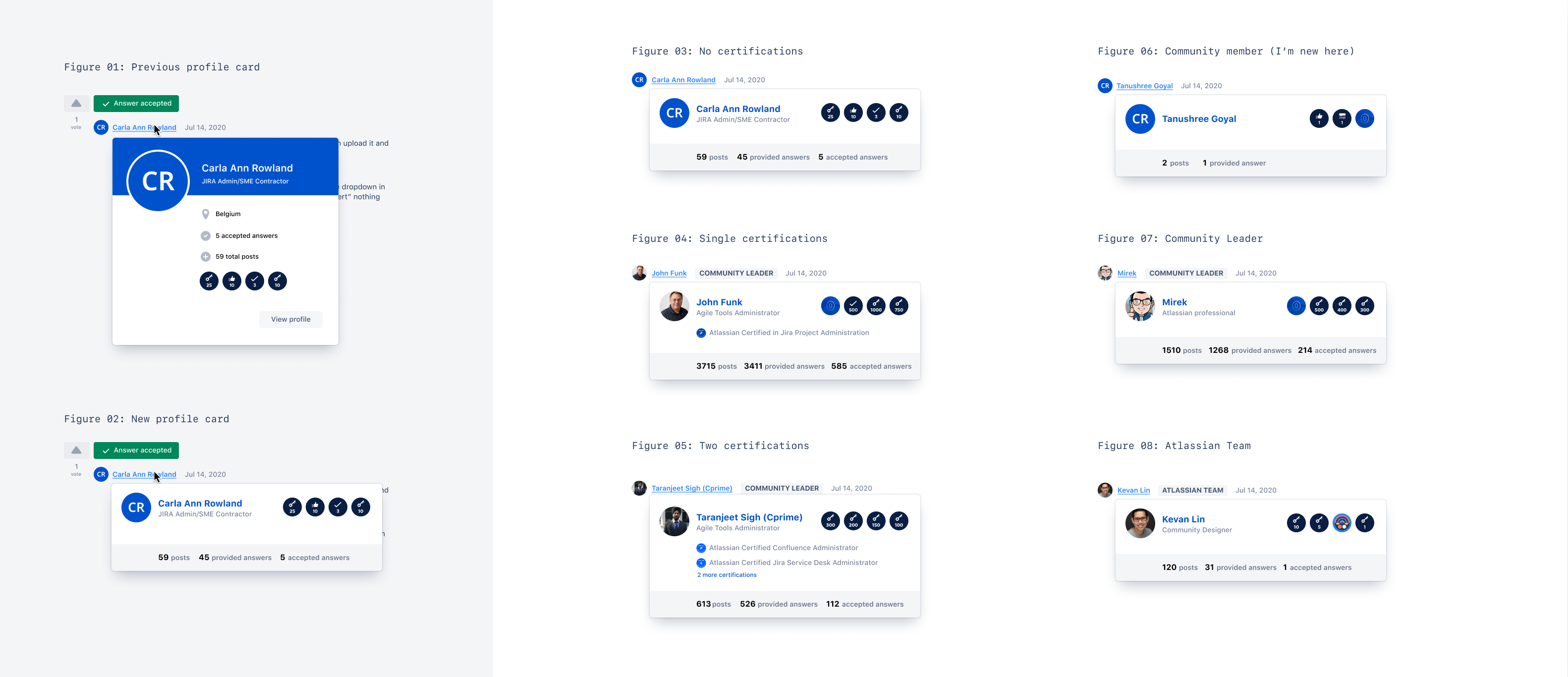
Previous profile card
Design principles
- Less is more, but more of the stuff that builds trust
- Connect people to collaborate better
Leaning on the design principles, which piece of existing data builds trust?
| Current | Proposed | Delta | Rationale |
| Avatar | Avatar | Builds | Real faces or images being uploaded versus initials or abstract shapes. |
| Name | Name | Builds | Real names or close to a real name. |
| Job title | Job title | Neutral | Often times user generated inputs to this profile field isn’t always complete and could be read incorrectly, e.g. “Administrator” Is this someone who is a system administrator or someone who is an administrator of the community? |
| Community role | Community role | Neutral | It does build trust, but it’s already displayed next to the person’s name. Is duplication necessary? Additionally, “Community Leader” is insider-baseball language and it’s meaning isn’t totally apparent. |
| Company name | Company name | Consider removal | Relevant information, yes, but adds noise that’s not part of credibility establishment. Can still be found in profile page. |
| Location | Location | Consider removal | Relevant information, yes, but adds noise that’s not part of credibility establishment. Can still be found in profile page. |
| No. of accepted | No. of accepted answers | Builds | Yes 💯 |
| Total posts | Total posts | Builds | Yes 💯 |
| Badges | Badges | Neutral | Badges are understood but the individual badges themselves may not be totally apparent. e.g. “Rising star” or “May Challenge” |
| View profile button | View profile button | Neutral | Necessary action but when seen in light of the primary action (establishing trust and evaluating whether an answer is worthwhile) this can be seen as a more a neutral building activity and can be seen as adding unnecessary noise. |
Before & After
After a few rounds of internal critique and design feedback, this was the result.
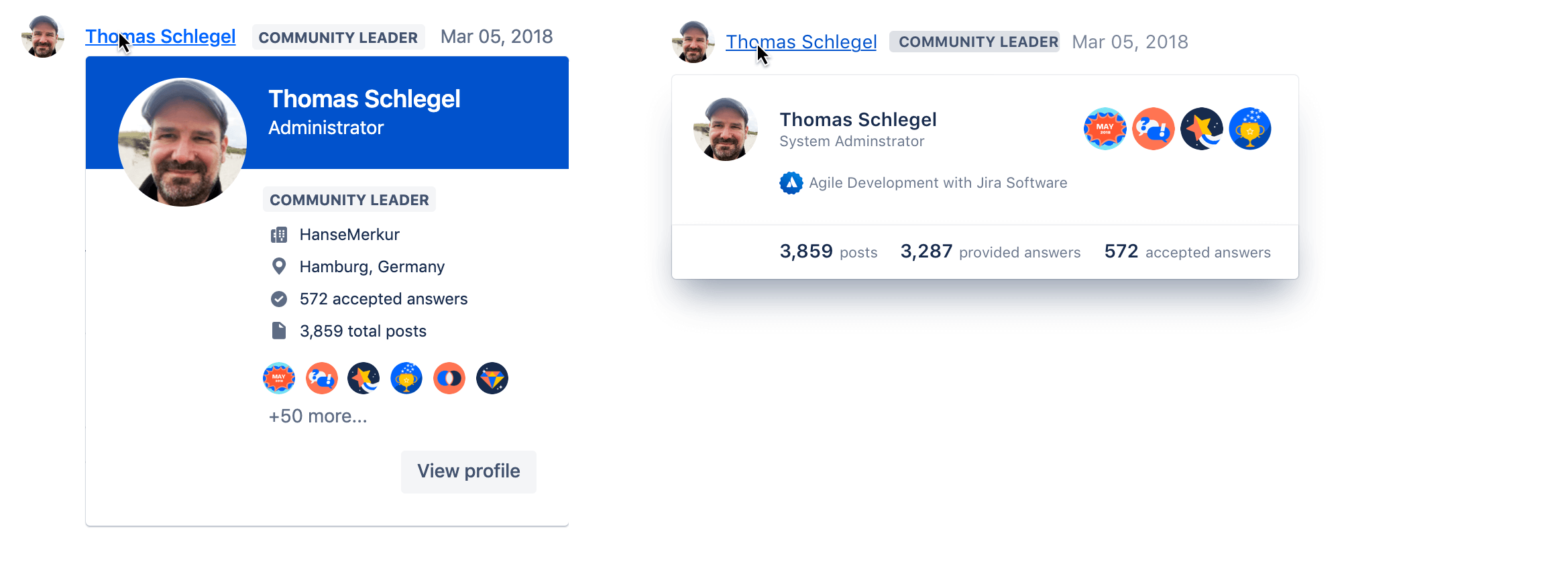
What's changed?
- Orientation of the card went from vertical to horizontal
- The blue header was removed to allow the eye to rest as it takes in this information
- The above elements (in the table) were removed
- The elements that stayed in were moved to more prominent and logical positions:
- Avatar got moved closer to the person's name
- Community activity got moved to it's own section with more emphasis on the counts
- Badges were placed in the upper right as a way to balance out the space and give them a unique place
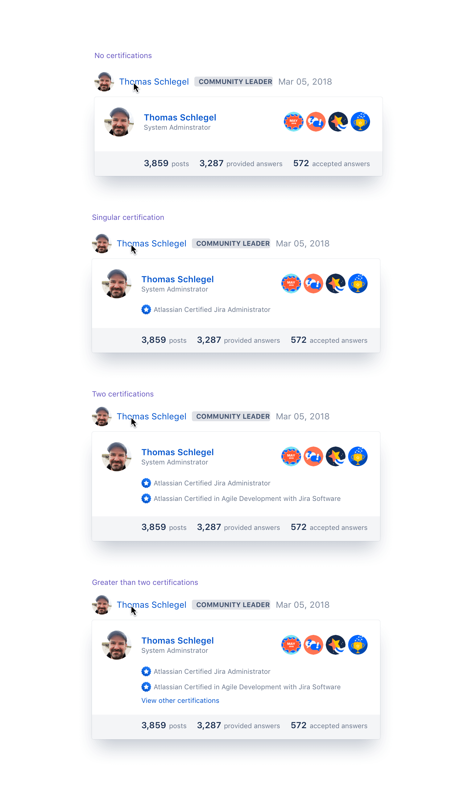
- Certifications have their own place on the profile card and are located right under the person's name and above their accomplishments in the community.
Visual changes
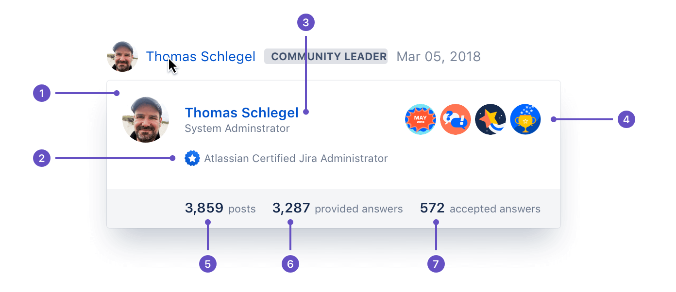
- Avatar
- Certifications
- Name of person & link to profile
- Recently earned badges
- Total posts
- Count of answers (creates a ratio of helpfulness)
- Count of answers that have been accepted
Outcomes
Profile cards are initiated on hover. The previous design initiated a hover event 126,000 times per month, on average. The new design increased initiations to 150,000 times per month.
Redesigning the profile card has shown a 119% increase in profile card views, and an 0.75% increase in click-through rates to the user's profile page.
Morever, the previous 30 day period before shipping, we saw a click through rate to user's profile page at around 0.25%. With the new profile the click through rate to the profile has increased to 1%. Which is rather interesting because the button is no longer there, and the name is the only clickable item to get to the profile page.