Improving question asking experience with personalized data
By speaking to our customers and leveraging customer data, I was able to deliver a best-in-class support experience.
Background
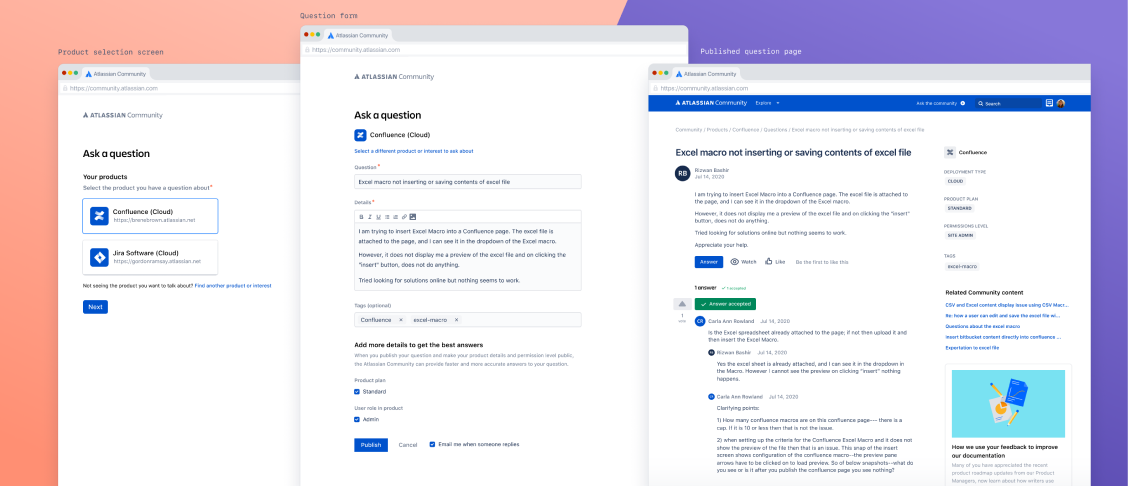
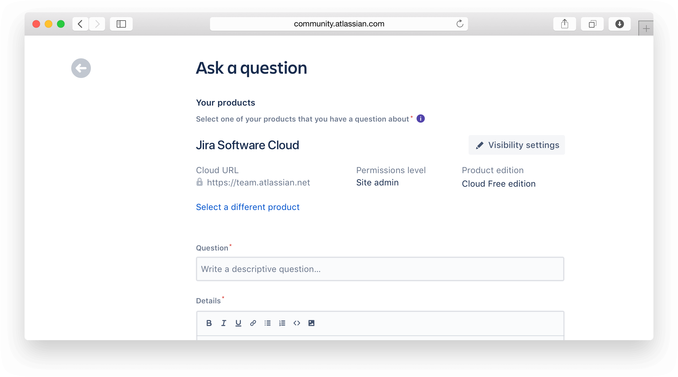
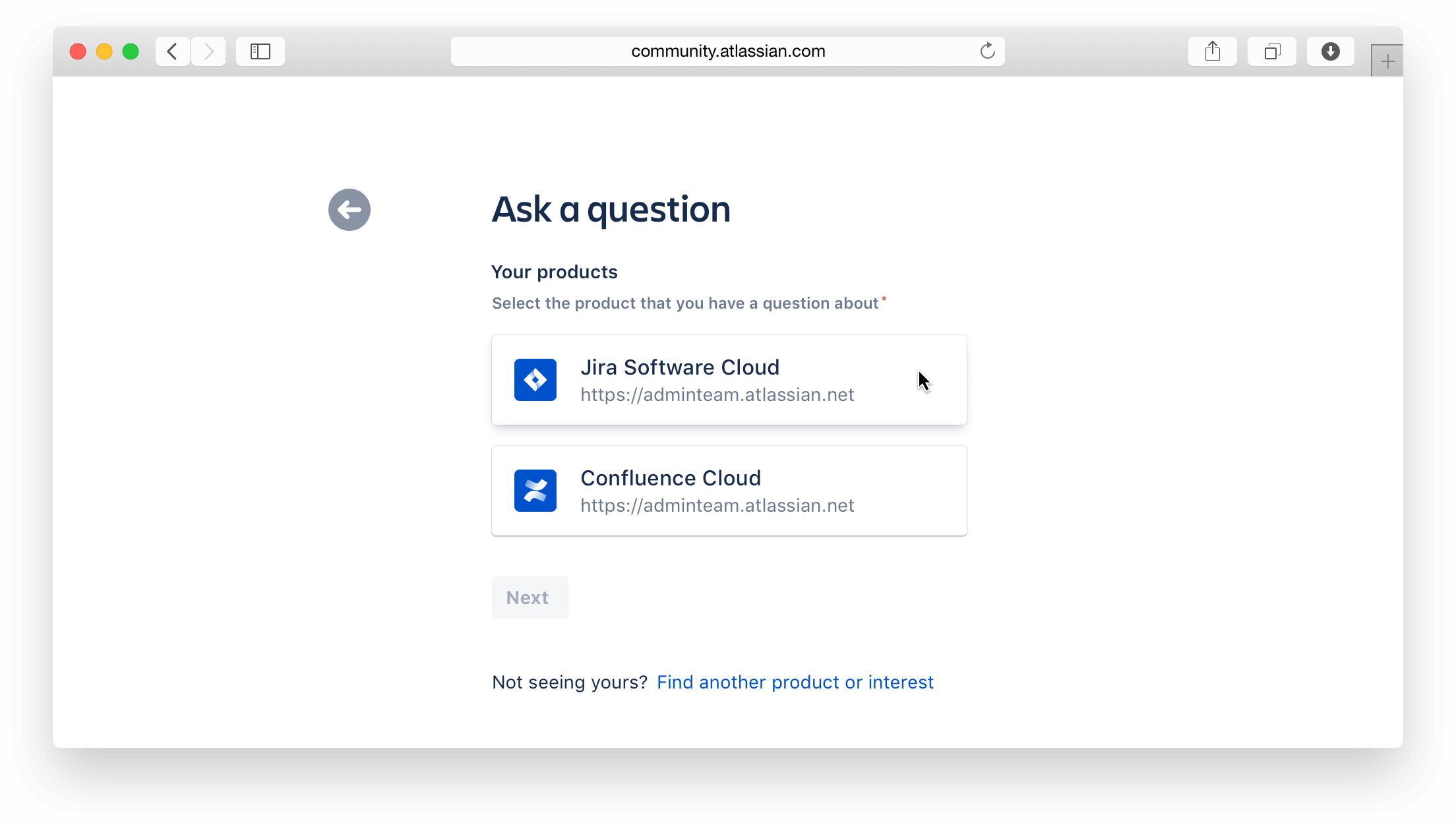
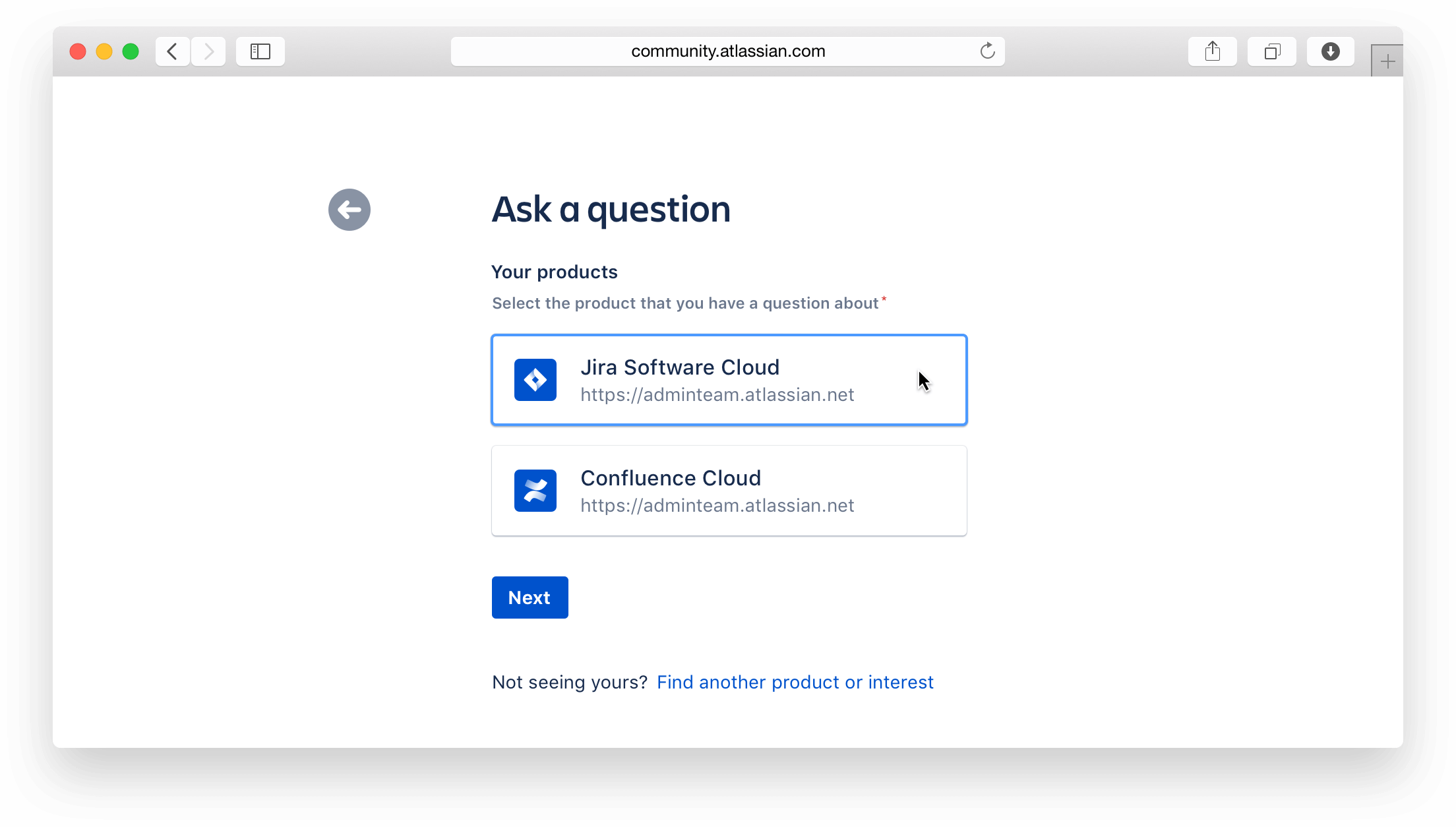
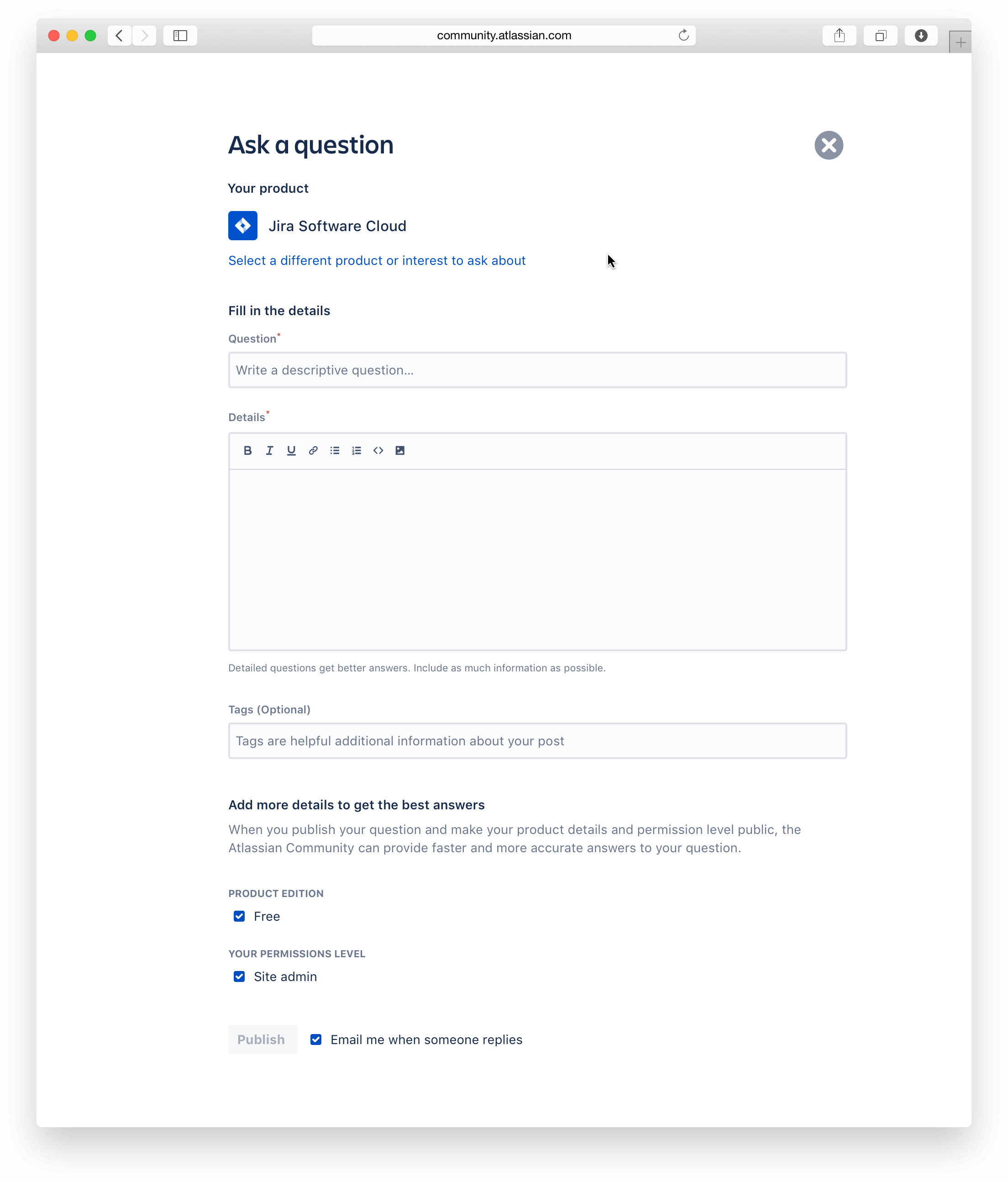
When posing a question to the Atlassian Community, the articulation of the details surrounding the product in question can make or break whether or not the question gets answered. Key data pieces like cloud instance or on-premise installation? If cloud instance, which product edition is it? Free or Standard? Are you experiencing the issue as an admininstrator or as an end-user?
Sadly, in the previous question asking experience, a lot of this nuance wasn't captured because the fields simply didn't exist. As a result, there was a lot of follow up questions being asked and the time to resolution was long.
- Role
- Design project lead
- Contribution
- Design process / UX
- Prototyping
- Visual design
- Collaborators
- Jr. UX Designer
- Principal PM
- Backend engineer
- Frontend engineer
Problem statement
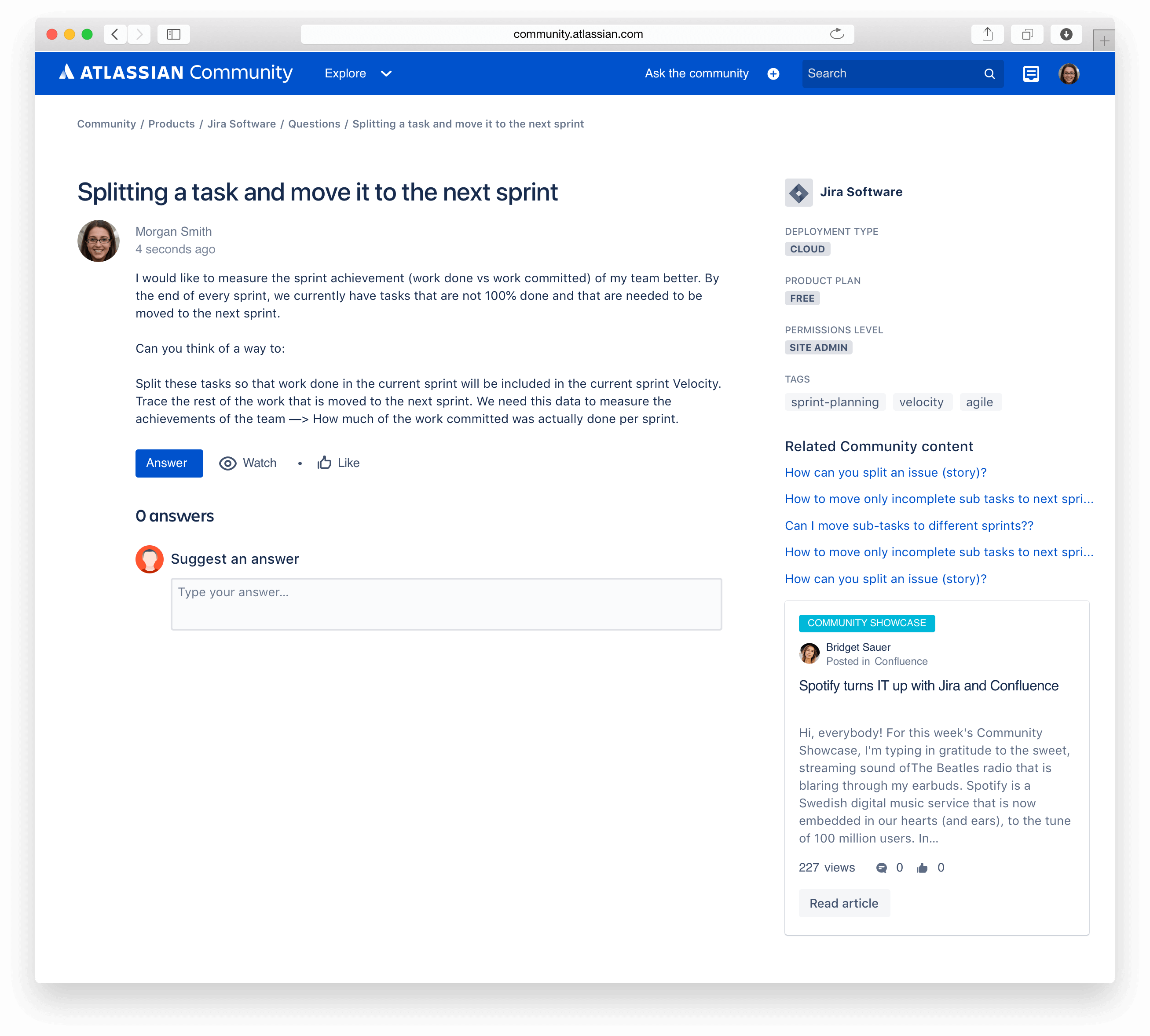
As mentioned in the background section, the immediate information to answer a question was not available and required time and effort by the original author. With roughly 87% of all questions being answerd by someone other than an Atlassian, it is imperative that non-Atlassians get the most detailed information around their fellow community member's context.
Business metrics
Support had made the conscious decision for community to be the preferred route for troubleshooting and resolution (for select products and hosting types). Due to this shift in strategy, the community would need to scale its ability to receive these questions and ensure they have a solid support experience. Personalization of the customer’s products enables the community to be able to capture the right data, so that answers can be given quickly and accurately as possible.
- We will measure success as reduced time for resolution to the customer on their question.
- We will monitor the abandonment rate throughout the various checkpoints of the create experience.
- It must perform better (more published questions), or the same, than the previous create form experience.
- Answer rate and accepted answer rate would increase due to this feature.
Design process
Members from multiple disciplines formed a working team, I shaped a six week schedule to deliver a confident vision.
Discover
How might we build something that elicits trust?
- Customer interview
- Journey map
Define
What part of the asking answer experience should we focus on?
- Workshop
- Mind mapping
Develop
How might we include trust and provide immediate value?
- Rapid prototyping
Deliver
Present a confident solution
- Design spec
Discovery phase
Discover insights into the problem by uncovering the problem space
How might we build something that elicits trust, especially because we're showing data that's personal to our customer's Atlassian product instances?
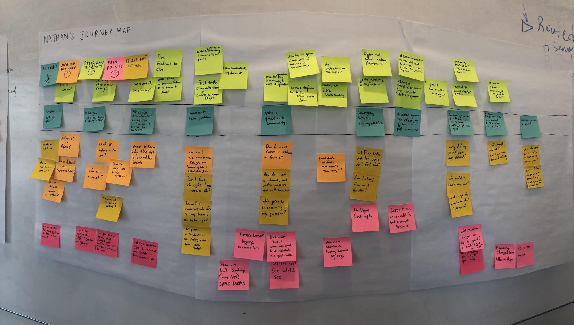
We first found a post in the community that contained missing information about the product and some back and forth between the author and an answerer. We interviewed this person as well as a few others.
From these interviews, we started to create a journey map. Participants of this exercise included the Product owner as well as some engineers.
Definition
Defining the area to focus efforts
Our journey map gave the team some useful insights:
- Don't speak the same language - Participant_1a lacked the implied knowledge of Atlassian products so they didn't know what to include on the question creation form.
- "Others can't see what I see" - As a pain point, they couldn't express to the community what they were uniquely seeing. They wanted a way to show their environment and set up so that others could help.
- Unnecessary complicated - the back and forth nature of clarifying questions, proved to be laborious and lasted too long (a lot of time elapsed from creation to final follow up).
- Potentially an unsatisfactory experience - Atlassian did not give him the best evaluation experience and it may affect whether or not they will purchase in the future.
Ultimately, we decided to double-down on #2 and make the pain point of not being able to replicate my current environment to be available on every post in the community. It would reduce the number of back and forth comments/answers and drastically cut down the time to getting an answer. Win-win for everybody involved!
Develop
Develop potential solutions aka prototyping
From the outset, we prioritized earning trust and delivering immediate and tangible value, as our pillars to this experience.
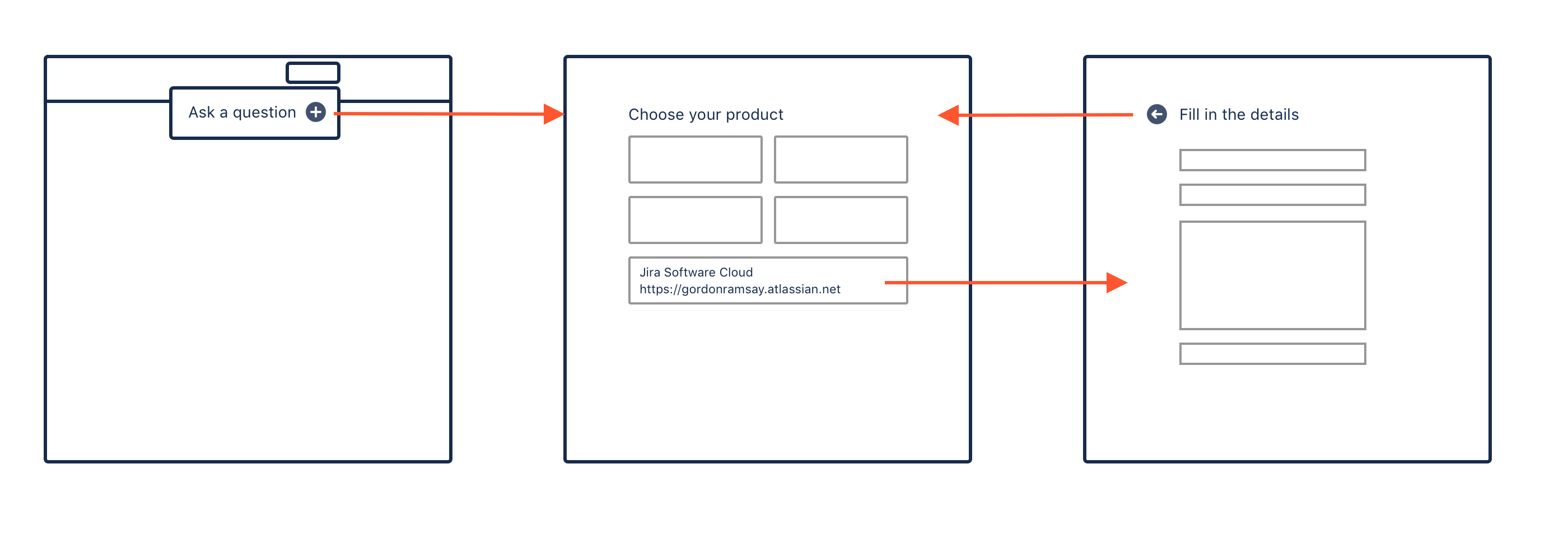
We started on the whiteboard making rough drawings of what the experience might be like. Early on in the process, we thought that it would be best to introduce some kind of interstitial before the actual form to allow customers the focus to choose their products.
Enter rapid prototyping
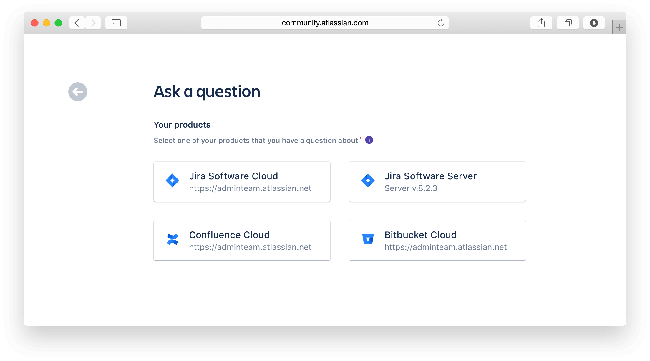
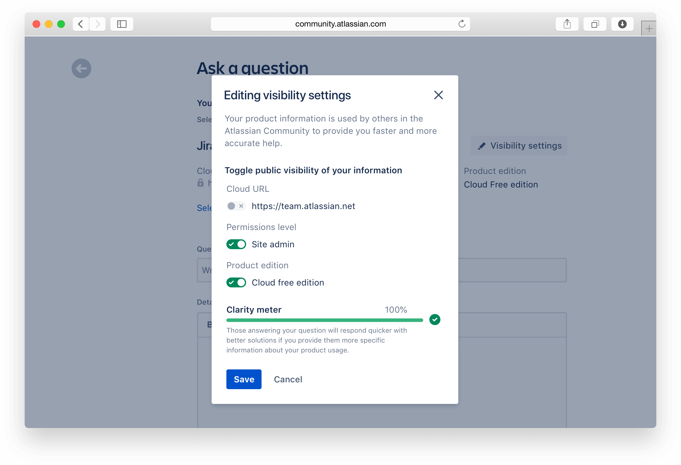
After a round of conversations, the team wasn't sure whether or not we should be displaying the "cloud url" after the interstitial product selection screen, on the question creation page. If so, how do we best denote that it won't be publicly facing? We decided to stand up a prototype through Sketch and InVision and test a few versions out with a few customers.
Would the cloud url being greyed out instill more confidence in the customer or not?
Learn and iterate
We heard from customers that the lock icon didn't make sense: Does the lock mean that I can't change it? Do I have the permission to change it?
We also discovered that many administrators of our products didn't know what the cloud url was nor did they understand the severity of displaying publically, this was evident based on how little time they spent looking at or trying to figure it out.
What if instead of being passive with the visibility settings, we were aggressive and showed your settings right after you chose your product and before you got to the form.
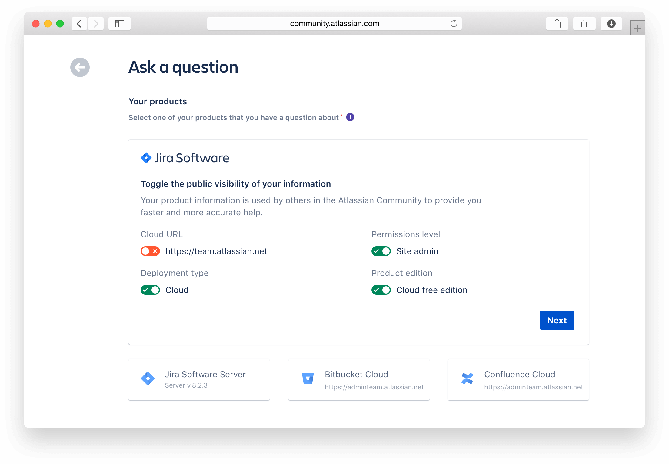
Well as it turns out, customers liked that they got to choose these visibility settings but ultimately wanted to get to their questions first before filling in this information.
Customers also didn't understand the red toggle switch. Does the 'x' mean that it's disabled? If I can't toggle this, why is this on here to begin with?
Learn and iterate
At this point, our hypothesis was, there's clearly something about the cloud url as a means of denoting locked or disabled by way of UI that didn't resonate with our users. None of them took any issue with selecting "their" product to move on. So why don't we remove the cloud url in next screen after they have chosen their product. We can also move elements around visibility lower on the form in favor of question completion.
Reaching confidence
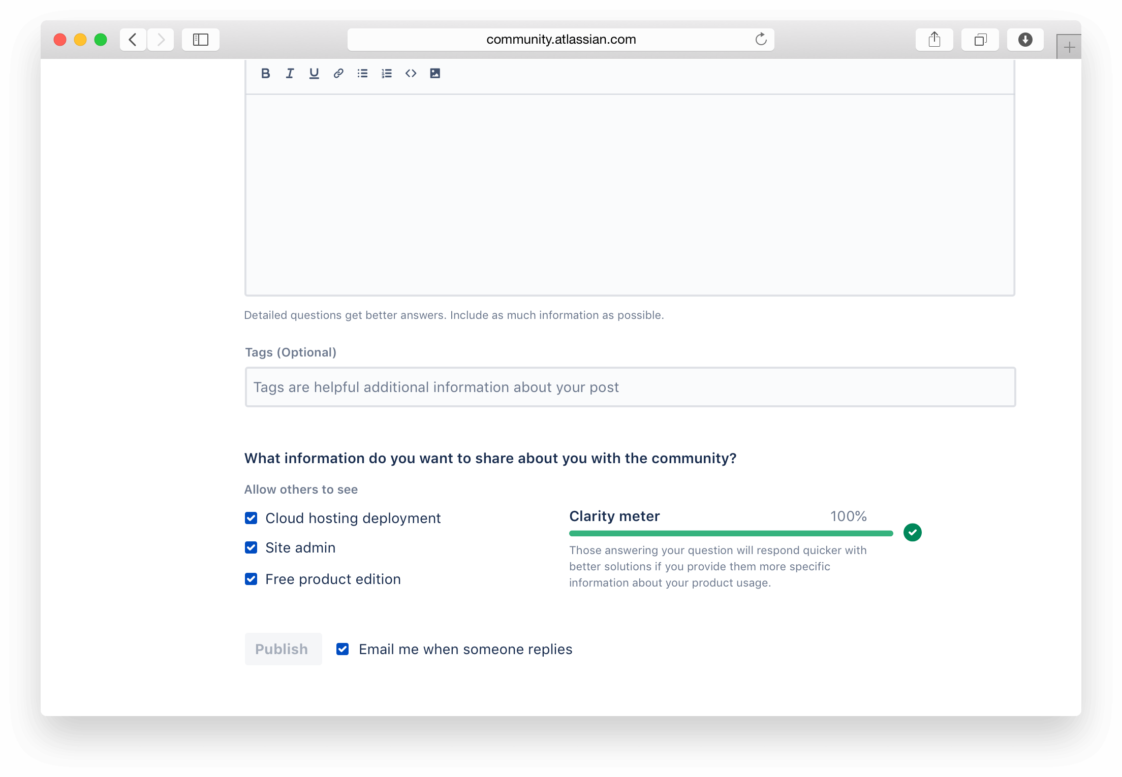
Customers trusted the last prototype the most. One customer said, "Despite probably being an alternative that will take me more time, it's more reassuring knowing that I can control the data that's being presented in such a fine way." More than trusting the prototype, the efficiency and confidence of which customers created questions (albiet through a prototype) seemed like an improvement. We had a winner!
Deliver
Deliver an experience with confidence
With customer feedback in the pocket, we began to put the polish on it all. We ran reviews on the copy and looped in legal for approval. This is the final result of the work.

Outcomes
Prior the launch of this new question creation experience, we were experiencing around a 40% abandonment rate on a daily basis. With the release of this feature, we saw an abandonment rate of 33%. We shored up 7% of posts due to this new experience being a factor.
We also wanted to make sure that the form was performing better or the same as the previous create form with regards to the number of successful questions published. With the old form, on a daily basis we were successfully publishing 60% of questions. With the release of this feature, we saw an increase of 7% (67% success rate) in successful publishing of questions.
In terms of measuring "reduced time for resolution to the customer on their question", we unfortuantely didn't get that data tracking in place for launch, so we haven't been able to determine whether or not the time for resolution was ultimately decreased or not. There's an open data analyst request for this at the moment.